Editor | ||
| ||
Component Browser
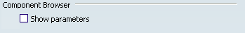
- Show Parameters
Select this option to display parameters in the Component Browser.
 By default,
this option is not selected.
By default,
this option is not selected.
Action at Double-click on components
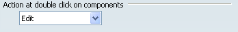
Select an action to be performed when double-clicking components (from the 2D graph diagram or from the Component Browser).
- Edit: to display the Parameters dialog box.
- Show components: to display the instance class of the selected component.
- Show class definition: to display the reference class of the selected component.
By default,
Edit is selected.
Components Visualization
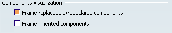
- Frame replaceable/redeclared components
-
By default,
this option is selected, and replaceable as redeclared components are framed.

- Frame inherited components
-
By default,
this option is not selected.
Background Color
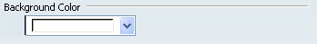
Select the background color to be applied in the Dynamic Behavior Modeling workbench.
Grid
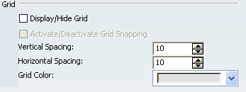
- Display/Hide Grid
Select this option to display a grid in the 2D diagram.
By default,
this option is not selected.- Activate/Deactivate Grid Snapping
- When the Display Grid option is selected, select this option to position the components on the grid only.
By default,
this option is not selected.
- Vertical / Horizontal Spacing
- Define a vertical and horizontal space for the grid.
By default,
the value is 10.
- Grid Color
- Define a color for the grid.
By default,
the color is grey.
Connection Starter
- Use the connection starter
- Select this option to create directly a connection, without using the Connection command.
By default,
this option is selected.
- Size
- Set a value for the connection starter size.
By default,
the value is set to 4.
- Shape
- Choose a shape for the connection starter.
By default,
the round corner shape is selected.